Shocking Reality of Magenta: The Impossible Colors in Your Art Palette
- Poulomi

- Nov 19, 2025
- 5 min read
“Magenta is assertive but not aggressive…”

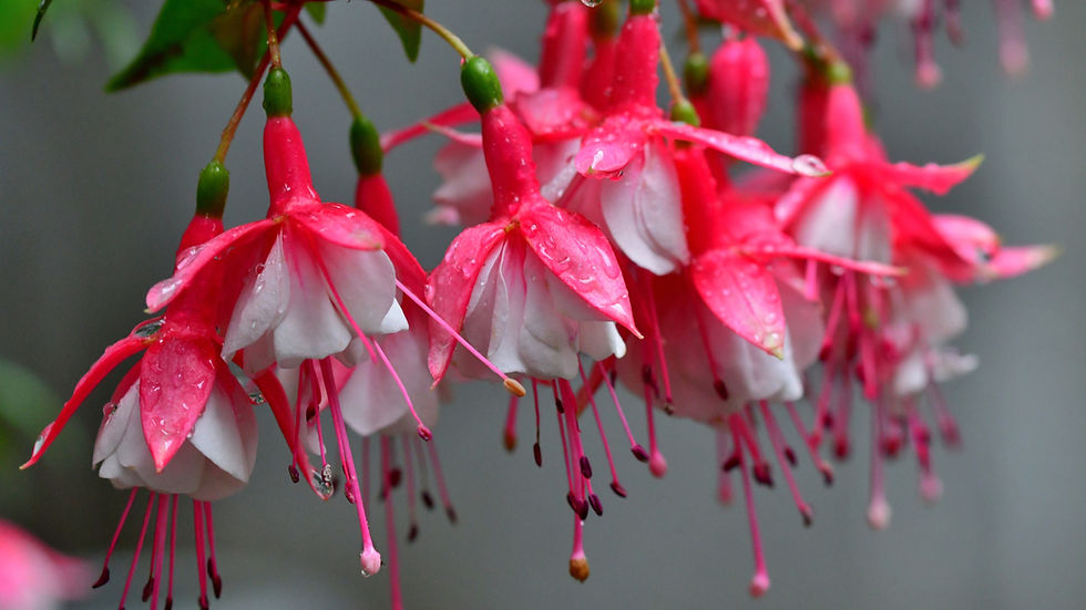
Can you recognize these flowers above? These are the vibrant flowers of the fuchsia plant, and the color is magenta, a color that doesn’t exist in reality!
It’s a shocking revelation, one that baffles us and makes us rethink what we see in real life.
Whether fact or fiction, the beauty of this impossible color is unparalleled, and that is why it is everywhere, from flowers, art, to décor and large-scale installations! It’s time to know more about the magenta color or colors that don’t exist!
Table of Contents
What is Magenta?
How was the Color Magenta Born?
Symbolic Meaning of Magenta
Magenta in Art, Design, and Installation
Can Magenta be perceived negatively?
What is Magenta?

Magenta, “the color of the future,” is an impossible color in your art palette because it is a part of the colors that don’t exist. Every color has a wavelength, and this hue is created when pure red and violet unite to create a new color.
You can call the hue pinkish-purple, but the real question that you might ask is: If this shade doesn’t exist in reality, why do we see it?
We have rods and cones in our eyes that help us perceive colors in the world. When you see the pigment, you are picking up signals from the wavelengths of pure red and violet all at the same time with your vision.
So, this shade doesn’t have its own wavelength and is therefore not a part of the traditional spectrum of colors. This mind-boggling reality makes us think – Why do our brains make up something that isn’t real?

The reason we see this hue is primarily linked to the activity of foraging in the wild by our primate ancestors, who were able to spot high-contrast flowers against the backdrop of a green forest.
As the species evolved with time, human brains became programmed to perceive this hue naturally, and the color persisted in our vision.
It’s like averaging out two wavelengths to create a new one, or filling out a space that blends the violet and the red, and it all takes place in the brain. Surprising, right?

Magenta is a part of a spectrum where the two ends of the colors, namely violet and red, blend naturally into one another to create the color.
Creating the Hue:
Take equal amounts of blue and red and blend the two pigments before adding some more red to create magenta pink.
How was the Color Magenta Born?
The pigment was synthesized for the first time in 1856 as a dye by Sir William Henry Perkin, and this new and revolutionary discovery led people to widely adopt the synthetic hue in the textile industry.
The inspiration behind this innovation came from the vibrant flowers of the fuchsia plant. In 1859, an intense battle was fought in the Italian town of Magenta, and the hue derived its name from the place itself.
Symbolic Meaning of Magenta

The meaning of different colors in art varies, and each one has a unique characteristic. When the warm red hues blend with the cool blue or violet hues to create magenta color, it's like the union of two different symbolic colors.
In color symbolism, while the warm hues mean action, the cooler tone conveys emotions and creativity. Symbolically metaphysical, it has importance in Feng Shui, an ancient Chinese practice of harmonizing the qi.
Ideal for marketing purposes, the pigment is used by renowned brands like Cosmopolitan magazine. The versatile shade is perfect for designing applications, especially for the modern generation and children, due to its youthful aura.
Apart from being symbolically metaphysical and action-oriented, the pigment also imbues confidence, luxury, and even the sweet emotion of compassion. The beautiful hue has several associations, and inclusivity is one of them.
This is precisely what makes the impossible hue an indispensable part of the LGBTQ+ movements. If you are aiming to avoid overwhelming the user experience in art and design, try pairing it up with contrasting and bright colors, and you’ll have a design that is not loud but quiet in tone.
To conclude, colors that don’t exist, like magenta, can either draw attention or scatter it, making it highly flexible.
Magenta in Art, Design, and Installation
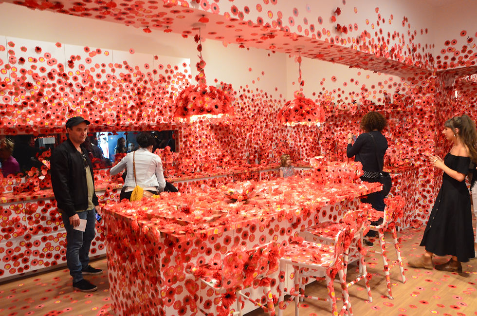
This impossible color in your art palette is evocative and thus, appropriate for an immersive experience, evident from the art installations by the Japanese artist, Yayoi Kusama.
Although red, Flower Obsession, a vibrant room full of flowers, might range from shades of fuchsia to magenta.
High-contrast flowers against a backdrop of green have our attention, and this specific characteristic is what makes it more suitable for online graphics. The shade not only creates excitement but also motivates users to take action.
Can you name some brands where non-spectral hues are present?

From popular brands like Baskin-Robbins to Flickr and more, the pigment is everywhere! This exquisite and unique shade of Viva Magenta is also declared to be the “Color of the Year” by Pantone in 2023 and is said to “vibrate with vim and vigour.”
There are several examples of artists whose paintings throughout history were painted in the colors of impossible hues. From abstract painters like Mark Rothko’s color field paintings, No. 3/No. 13 (Magenta, Black, Green on Orange), and kinetic waxwork by Anish Kapoor, for example, Past, Present, Future (2006), to op art work by Bridget Riley, the pigment has persisted over time in art as well. What more?
The largest art installation by artist Katharine Grosse is a spray painting of the pigment, an explosion that seems to be in motion in the wide space, almost as large as 5000 square meters.
Lastly, its representation of luxury makes the hue an ideal choice for runway collections and home décor.
Can Non-spectral Hues be Perceived Negatively?

Yes! The color can create a chaotic feeling if not harmonized with softer hues and might give off an overstimulating feeling. Magenta, associated with sophistication, can be flashy at times, detracting customers from the brand message and overall authenticity.
Moreover, the color is not suited for any professional environment where subdued colors are the norm, and also because it does not align with the seriousness that the brand demands.
Bottom Line
All the colors in the world are beautiful, and the magenta color is both exquisite and profoundly appealing to the human eye. It’s fascinating to know about how the human brain functions in the context of the way we perceive colors that don’t exist.
This stunning hue looks aesthetic in both art and design, which makes it a perfect element for branding. Its symbolic meanings are just as deep as the shade itself, and it represents the harmony between blues and reds.
Overall, this color can be overwhelming unless paired with the right hue, but if you are aiming for a quiet tone, contrasting colors might be an ideal choice!


