Mastering the Palette: How to Evoke Deep Emotion in Your Art
- Avani

- 4 days ago
- 5 min read
An artist doesn't only paint or draw or craft their art with just the tools and colors or even with techniques; they craft it with their vision, their hard work, and their emotions and mood as well. Indeed, it can even be a feeling, like love, or a psychological trigger. And the one thing that defines that mood is the color artistry done in that art. The colors are the ones that appeal to the human soul, which bypasses logic mind and taps the emotional side.
From a cool cerulean to a warm deep ultramarine, a subtle shade change can dramatically affect the viewer's interpretation of the work, transforming an ominous landscape into a quiet haven.
Whether you're just starting out or you've already established yourself as an artist, developing a creative voice means overcoming the urge to use colors by accident. Knowing the value of the technical and emotional blend in your palette is the quickest method to take your present portfolio from a casual hobby to the point of exhibition-ready mastery.
The Psychology and Science Behind the Pigment

Real trust and real authority are going to require more than just elementary school color wheels and a beginning to think of color harmony as a storytelling tool. Colors have intrinsic psychological weight; it is deeply biological and cultural.
Planning a color painting is more than an aesthetic decision; it is a painting set. Try to think about how these basic color schemes alter the story of a work:
Monochromatic Restraint and Focus
The use of variations of a single color, in which only the value (lightness/darkness) and saturation (intensity) have been changed, will immediately create focus and great depth that evokes atmosphere. Keeping shades aside, there are no distractions for the viewer to pay attention to while looking at texture, brushwork, light, and form. In the past, artists have employed monochromatic color schemes to capture emotions of loneliness, longing, or eternity. It guides the viewer's attention to the focal point, eliminating visual distractions.
Analogous Harmony and Natural Order
When you select 3-4 colors that are adjacent on the color wheel, e.g., green, blue-green, blue, there is a natural harmony, peacefulness, and unity. Combinations that imitate the subtle shifts in color artistry found in nature are naturally pleasing and low stress to the human eye, such as the gradient of a sunset or that of an ocean scene, or a dense forest canopy. Analogous colors are ideal for achieving a sense of relaxation, stability, and reflection.
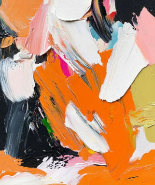
Complementary Tension and Visual Vibration
Bringing opposites together (like orange and blue, or yellow and violet) produces a phenomenon called simultaneous contrast. These colors, when put together, enhance the color's vibrancy and intensity, creating a literal vibrating effect on the retina. This color art technique is instantly noticed and lends a dramatic influence that maintains the eye's dynamic motion across the canvas. A tool that can convey high energy, conflict, or vital force.
Read More:- Color: How it changes the mood in art
Keeping Colors Under Control In The Studio

In true color artwork, the interplay of the pigment in various situations and with other colors must be balanced. These are the things that are noticed in a color contest as well.
A very common mistake of developing artists is to use colors as separate pieces. A red square with black around it will be very different from a red square with bright yellow around it.
You need to master the three dimensions of color to be complete in the control of your medium.
Hue: The actual color, the origin of the color (e.g., Red, Green, Blue-Violet).
Value: The lightness or darkness of a color in relation to another color. This is the skeleton of your color painting. This is the backbone, as it creates a focal point.
Chroma (Saturation): The strength or saturation of a color. The more that a color is mixed with its complementary colors, the more it will be muted and low in its chroma.
In considering your color artworks, keep in mind that low chroma (muted or grayed down) colors do most of the work. If all the colors on your canvas are shouting at full volume, the viewer's eye will never get any rest, and this will lead to visual fatigue. For 80% of the composition, use earth colors in neutral, muted tones; for the most important focal points, use high-saturation colors.
Presenting Your Work for Exhibition
After you've grasped the technical aspects of color theory, the next logical step in further professional growth is to apply your studio practices. No art can be created without the input from others. It calls for removing the work from the private studio and putting it before a broader, objective audience.
It is great for artists to take part in an international color contest to see what, if any, impact the visual language has on the public and on the professional curator. At a juried exhibition, you are required to critically examine your portfolio as though it were an exhibit on display.
An open call is not being judged by a panel of judges for technical skill alone – it's about intentionality. They're interested in knowing that your color temperature options, your value adjustments, and your harmonies weren't just picked out of the hat. They want to know that every color temperature choice, every value change, every harmony, was made deliberately as part of a larger idea.
The Studio Audit: A Checklist for Your Masterpiece
When you sign your name to a piece and say that it is finished, go through this rigorous evaluation checklist that is used in the studio to make sure it is suitable to be displayed in a gallery:
The Grayscale Value Check: Take a picture of your painting with high resolution and reduce the saturation of the picture to 0% on your phone or computer. Is the black and white version still well contrasted, clearly in depth, and has a clear point of focus? When a picture appears flat or muddy monochrome in black & white, the colors in that picture are competing against one another in value, which means there is no structural integrity in the composition.

In the Dominant Temperature Rule, warm colors (reds, oranges, yellows) and cool colors (blues, greens, purples) should not be equally divided 50/50. A balanced split makes for visual confusion. Rather, dominate one temperature on approximately 70% of the canvas, and use the other one as a conscious, intentional accent.
Edge and Boundary Analysis: Pay attention to the edges of your color art. Hard, sharp edges of high contrast are immediately noticed. Smooth, blending colors can merge to produce atmosphere and mystery. Only use hard edges where you want the viewer to see the longest.
Implementing these proven rules in your creative approach moves you from merely filling in a blank canvas with paint to immersive visual experiences. It's this discipline and sense that will make you a master. It will open the doors of opportunity for you to represent your color artworks in galleries and build your artistic legacy.